A few weeks ago, I read a post on Design Observer by Michael Bierut on “how to be ugly.” In it he used the magazine 032c’s recent design to talk about the aesthetics of intentional ugly design by a good designer. He cites sources that more or less declare that ugly is back and it sounded like we’re re-entering a Dark Age of some sort in design aesthetics.
That got me thinking: is there an “upper-class” of graphic design, where only the well-known graphic designers like Bierut and Paula Scher can appreciate and allow, and anything else is just crap? And that the “lower” designers and the general public can’t understand why it’s good except that it’s designed by famous designers?
Analogy to Clothes and Food
I mean, I feel that graphic designers already have this reputation for being an arrogant class that cannot stand the “regular” people using Photoshop filters or outlined type or motion tweens and 0% alphas, so it’s kind of unfortunate to think that within this “class” there’s another hierarchy of judgment that split us up even more. I feel that this exists because the other mainstream arts have this, like fashion and cuisine, for examples. Sometimes I don’t understand some of the wacky colors and materials that models only wear in shows but not on the street, or why there’s a dinky yet expensive piece of steak on a large white plate that certainly won’t get me full. When I see this stuff, I keep telling myself that it’s for the sake of experiment and medium exploration, which I totally support. So in that case, should graphic design be like that too?
But unlike fashion or cuisine, graphic design is so democratic. Yes, even though not everyone can use Photoshop to the best of its abilities, an amateur can still design a crappy flyer and get paid for it. But not everyone can design and mass produce an outfit that people would want to wear outside, nor can he or she cook a multi-course meal and serve to customers without fearing that they might throw up or get food poisoning. With graphic design, everyone can participate, and very rarely will a poorly designed book jacket and poster directly harm the customers. While there is still a certain level of aesthetic rules that good design follows and designers evaluate against, like typography, color harmony, structure, etc., there really isn’t a “high graphic design” class that is supposed to define the trends for all of graphic design for Spring 2008 or whatever. That’s not what graphic design is about.
Ugly Design
“High graphic design” talk aside, I can see what Bierut’s talking about with ugly coming back. As I was a couple of paragraphs into his post, the word ugly began to remind me of the I Knows Me Some Ugly MySpace Showdown competition that Ze Frank hosted on “The Show” in the summer of 2006. The Internet has further spread this democracy that is graphic design onto the public, resulting in a lot more amateur, straight-up ugly design (even in the eyes of non-designers) in the world. (I recently learned that these wonderfully ugly MySpace sites had paid help from entrepreneurs taking advantage of this new medium.)
This Whole Thing with Wolff Olins
To be honest, I was not a fan of the 2012 Olympics logo when it first unveiled. I’m still not a fan now, but at least I understand where Wolff Olins was coming from, to a certain extent. I keep telling myself that this is going to get better as we see more of the supporting branding materials; everything will fall into place when 2011, 2012 come around. We just have to wait and see. Because if this still looks like crap when the time comes, I will probably lose hope on all that is good and pure about humanity, because that’s what the Olympics means to me.

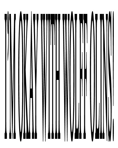
Based on Wolff Olins’s reasoning behind the 2012 Olympics logo, I can tell that he wanted something really different from the past Olympics logos (which I find good enough for the context of the host city/nation, but whatever) where people are encourage to participate in the conversation, which goes with the current trend of community interaction, especially on the web (or Web 2.0). Despite the “wacky” Wacom identity and the fat NYC logo (which I actually think is not that bad considering the branding possibilities that Olins had pointed out), I want to quietly inform you all that I am a semi-closeted Wolff Olins fan (Armin Vit shares my view, I think, via that “NYC logo” link). “Semi” because I don’t know where exactly he’s going with this, but I can see the potential for something great.
All in all, I think that ugly is inevitable, but it’s not necessary a bad thing. I believe that like almost everything, the world needs balance, and without the ugly, there’s no beautiful. And without the ugly, there’s no need for designers decorators.
Flush.